Conceptualizing an Illustration
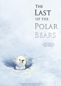
This promo illustration for The Last of the Polar Bears, portraying an iconic scene from the first chapter of the story, had a pack a lot of punch with a minimalist execution. With so little detail, it wasn’t difficult to draw, but every aspect of it needed to be just right.
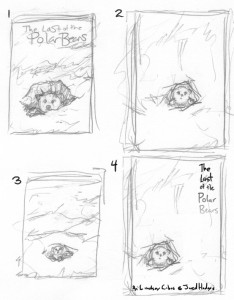
I find it very helpful to create a number of tiny thumbnail sketches, to quickly try out different takes on an idea. Working with a general idea of a polar bear cub poking his head out of the den for the first time, finding himself surrounded by an unending sea of white snow, I created a couple of concept sketches:
In these examples, note how composition, placement, and size of the cub play a big role in mood and feel.
- #1 is a strong close up on the cub’s face, grinning as he takes a peek at the outside world – cute, but completely at odds with the title of the book.
- #2 is closer in feel – the landscape is vast, the cub is small–there’s a real sense of loneliness going on, but it’s so far pulled out from the character that scene no longer feels intimate.
- #3 is almost right on target. The cub is cute and awestruck without looking too giddy. But the centered figure is boring and predictable.
- #4 takes the aspects of #2 that I liked, but moves the cub into the lower corner. The title is placed in the upper right corner to balance the piece.
Once I had the composition figured out, I set about drawing the character.
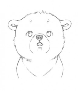
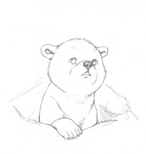
He went through several drafts (including some slight variations with him smiling, not shown here) before I finally hit upon a version that worked for the poster.
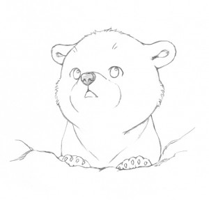
And here you have it, the finished line art of the cub seen in the poster (flipped in the illustration):
 Stay tuned for lots more. I look forward to introducing you to this little guy and the rest of his family. 🙂
Discussion ¬