Finding the Right Pose – Archie Character Designs
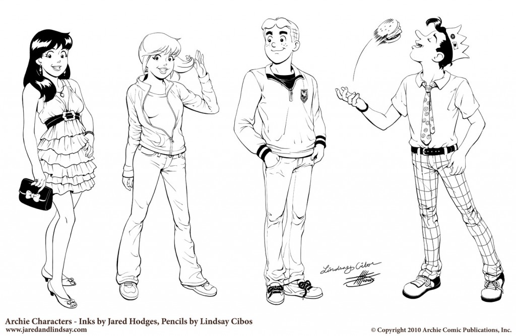
Recently, I put together some Archie character drawings to try out for a penciling position.
Finding the Look
Working with pre-existing characters is different than designing your own. I first had to familiarize myself with nuances of the “house style” to draw the characters on-model. I did this by sketching the characters, while carefully studing the spacing and proportions of their features, especially their faces.
Finding the Pose
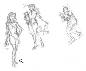
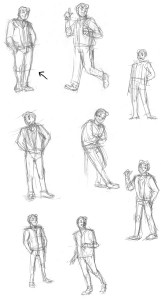
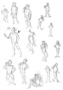
Once I felt comfortable drawing the characters, I did some thumbnail sketches for each character’s pose, searching for the best character-appropriate gesture for each. It’s worth noting that when I’m doing gesture sketches like this, I’m working small and fast. I’m not worried about proportions or details–that comes later. This is all about finding the pose.
Veronica
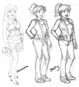
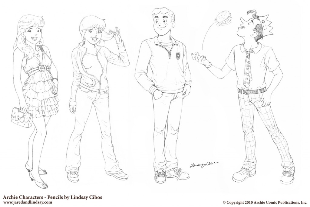
Veronica is the rich girl that pretty much gets what she wants. I decided to give her a hand-on-the-hip pose that emphasized her confidence and stylishness. For her outfit, a cute flirty dress, clutch handbag, and a bit of bling. I briefly entertained the idea of a more illustrative shopping scene for her (with bag carrying Archie in tow), but decided to stick with standalone poses.
Betty
To contrast Veronica, I went with a sportier pose, and jeans and jacket outfit for Betty. I got pretty far in the drawing when I realized the pose was a bit too similar (hand-on-hip again) to Veronica’s.
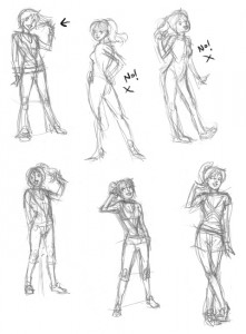
Keeping the keywords “cute” and “sporty” in mind, I started over. Of these, the first two I did (upper middle, upper right) weren’t right at all for Betty — too sexy; too cutesy. After that, I stopped and reconsidered the character. Sweet and sporty. I liked the gesture of Betty twirling a finger around her hair to showcase her ponytail, so I kept that in the rest of the sketches. I ended up going with my third attempt (first sketch on the top left).
Archie
Archie’s your average, nice guy character that everyone gets along with. For his pose I decided to show him “just hanging out”.
Jughead
Jughead’s the goofy comic relief character. To capture his cartoony mannerisms, I tried to push his poses towards the extreme (without going too far). I thought it would be funny to show him tossing an entire burger in his mouth the way you might with a piece of candy.
Polishing the Art
Once I had my poses selected for each character, I printed out the sketches at a larger size with blue lines so I could do a clean pencil pass over them with their proper details and proportions.
And here’s the finished results!
Discussion ¬