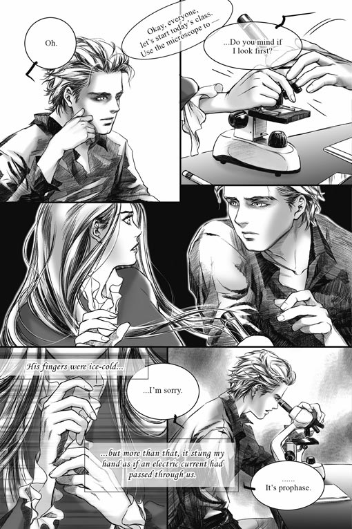
There has been a lot of scrutiny over the lack of quality in the lettering of the Twilight manga adaption. I don’t disagree. The lettering is lackluster, difficult to read and feels like an afterthought– word balloons seem to be transparent and awkwardly placed for no other reason than simply because there wasn’t any space allotted for them when the artist made the page.
For example, the second panel of this sample page shows two hands touching over a microscope, but a word balloon has been plopped over top of it, covering the primary focus of the panel with dialogue:
I’ve read a number of blog posts listing lettering mistakes in the Twilight manga. But while there are basic guidelines for readability, lettering is not an exact science. As with other art forms, the art of lettering is subjective. Some of the techniques that have been identified by some bloggers as “wrong”, such as word balloons bridging multiple panels, transparent word balloons, and overlapping word balloons, can actually be used to good effect under the right circumstances.
Here are some examples from various manga to show you what I mean:
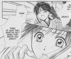
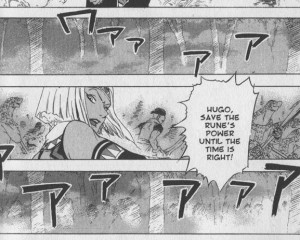
Word balloons bridging between two panels – This can be an effective and interesting way to transition between scenes, or tie two panels together for a greater emphasis of their connection to each other.
In this scene from Fushigi Yugi Genbu Kaiden by Watase Yuu, we see Takiko’s change in reaction over two panels as another character gives her insight into the reasons behind an earlier event. The bridging word balloon makes the transition feel smoother and her reaction immediate, as the other character is speaking. Breaking up the dialogue into two separate balloons would have changed the timing of her reaction.
In the Suikoden III manga, Aki Shimizu raises the tension of an opposing army charging forward by connecting Lucia’s word balloon to the adjacent panels. This gives us a sense that the enemy’s war cry is ongoing (*and* getting louder – note the increasing size of the “aaaAAA” sound effect) as she instructs her son, Hugo, to make a critical choice. (Translating the war cry sound effects into English would have further increased their impact, but that is a whole other topic.)
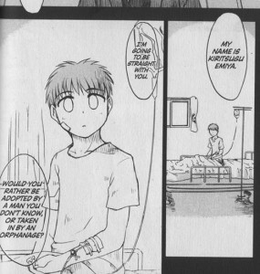
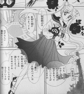
Transparent word balloons – Used sparingly with thoughtful application, transparent word balloons can allow text to greater integrate with the imagery contained within the panel.
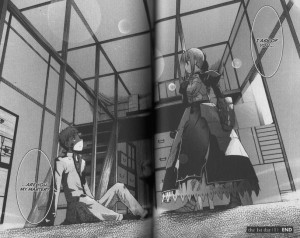
In these examples from Fate/stay Night, the transparent word balloons have a piercing effect, as if the words are going straight through the character as they are told something confusing, shocking, or unexpected.
In all of these examples, there’s plenty of room where balloons could have been placed without obscuring the artwork, so I think it’s safe to assume that they are intentionally transparent for effect.
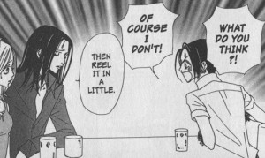
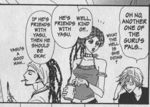
Overlapping word balloons – Effective for indicating that a character is responding quickly, talking over, or interrupting another character.
Here’s two examples from Nana by Ai Yazawa, one of my favorite mangaka. Showing the nuances of character interaction is one of her specialties.
In this panel, Yazawa uses the proximity of the word balloons to contrast between Nana’s explosive outburst and Takumi’s quick but cool-headed reaction.
In this panel, Junko’s boyfriend Kyosuke adds detail to Junko’s comment. The overlapping panels here give the impression that these romantically-involved characters are working together to build upon each other’s thoughts.
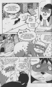
Finally, here’s an example from my own book, Peach Fuzz (volume 3, pg 56). This page utilizes all three techniques:
In all of these cases, the style of the word balloons helps express the tone and intent of the character without ever sacrificing readability — that’s important. These techniques should not be used on every page, only when there is a need for it. To use word balloons effectively, I find that it’s essential to plan out the word balloons at the same time I’m composing the actions and layout of a page – during the roughing stage.
There’s a *lot* more you can do with word balloons and lettering to enhance the story. I’ll cover more of the basics and other creative techniques in a future post.
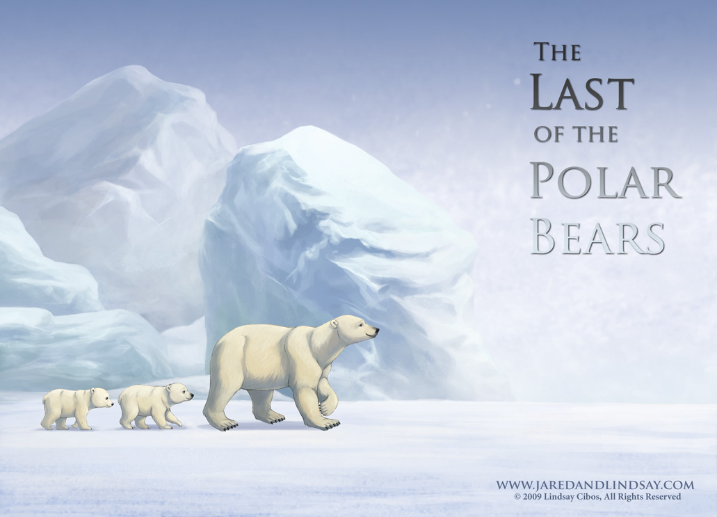
Here is the second illustration I’ve done for The Last of the Polar Bears, created for the back of my winter promo postcard to celebrate the new year.
One of the questions I’m frequently asked is how to go about “breaking into” the comic industry. It’s a tricky question to answer, because there is no direct path. The comics industry is a tough business to break into. There’s a lot of competition. And even once you’re “in”, every new assignment or project still requires effort to get (though publishing credits do help!).
The most important thing you’ll need are strong, stand-out sample comic pages that demonstrate your skills in sequential art. You need to be capable of drawing characters consistently on-model and capable of expressing a gamut of emotions, as well as the ability to draw backgrounds in perspective, clarity in sequential storytelling, dynamic action, and clear but exciting panel layouts. The best way to get that is to keep working at it. The more you draw, the better you’ll get. Challenge yourself to draw outside of your comfort zone. Draw everything, not just people. The ability to draw human characters is, of course, essential, but comic artists should ALSO be able to draw whatever the script calls for: backgrounds from busy cityscapes to dense forests, cute puppies to ferocious beasts, racing cars to horse-drawn wagons.
Depending on the publisher, the way to get your work seen is to take it to a convention where an editor is doing portfolio reviews. They can give you the feedback you need to further improve your pages, or if your work is good enough, hire you on the spot.
The way I got my start with Tokyopop was through their 2nd Rising Stars of Manga competition. (Tokyopop is no longer doing the Rising Stars of Manga, but nowadays there are also other competitions running such as Kodansha’s Morning Magazine International Comic Contest, in which Jared’s and my entry, Last Dance, placed as a finalist).
For RSOM, I followed the guidelines, and sent off a short self-contained 20-page comic that landed me grand prize. The editors loved it so much that they asked me to put together a full three-volume version of the series. You know how that turned out. The series was Peach Fuzz. 🙂 From there, I had the credentials and work behind me to get a job as a penciler on Sabrina the Teenage Witch over at Archie Comics.
If you’re interested in writing and drawing stories, the steps are similar but somewhat different. You’ll need to put together a comic pitch based on your desired publisher’s guidelines. Every publisher is different about what they want. It helps to be aware of which publishers are looking for submissions, and what they want, so that you can tailor your submission to their needs. Check publisher websites for guidelines. But in general, it amounts to about 10-15 sample comic pages, a short (2-3 pages) synopsis of how the story would play from start to finish, character designs and bios, and a persuasive query letter.
(There’s also self-publishing and web comics. But that’s a topic for another day.)
I wish you the best of luck in your efforts! 🙂
